Budget Friendly Makeover: Guest Room under $350
Hey ya’ll! I know why you’re here. You want to see the reveal and design of the guest space I talked about in my inspo post, and I am happy you’re here. Before we get into that, I want to say thank you for checking out the post and leaving such encouraging comments. I’m glad…

Hey ya’ll! I know why you’re here. You want to see the reveal and design of the guest space I talked about in my inspo post, and I am happy you’re here. Before we get into that, I want to say thank you for checking out the post and leaving such encouraging comments. I’m glad you all are enjoying my expansion into other areas outside of food! Ya’ll are the best!! I also want to thank AllModern for the opportunity to create this room refresh through their sponsorship.
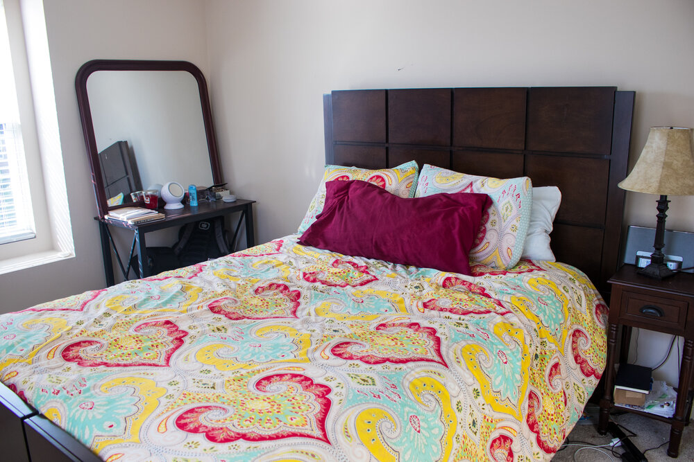
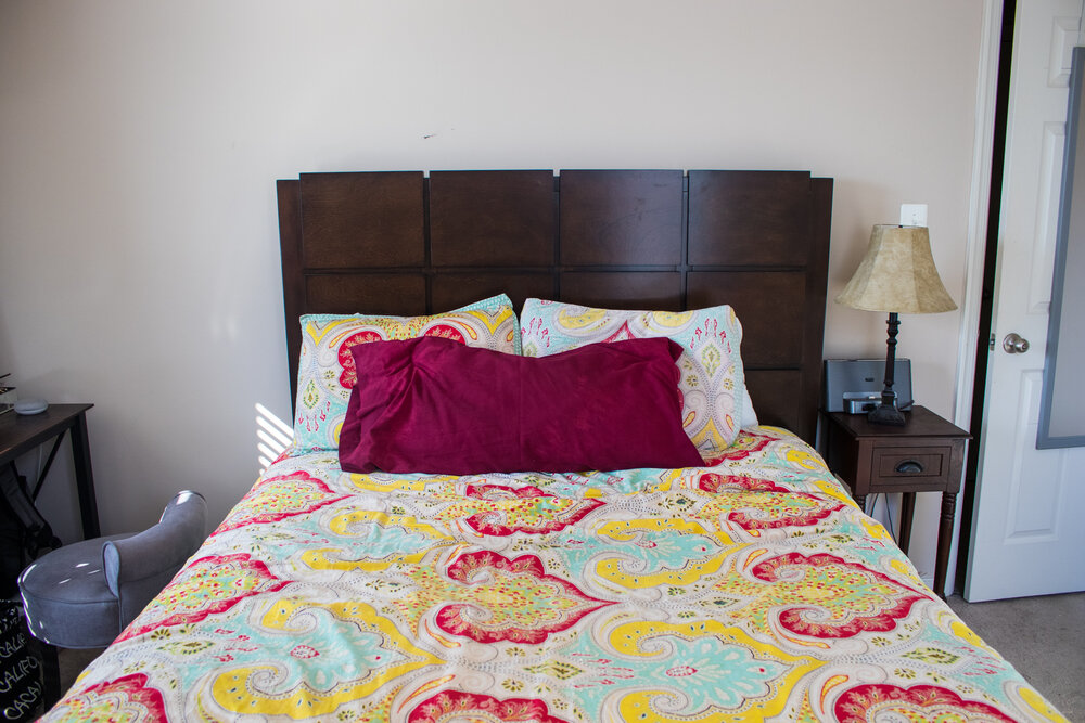
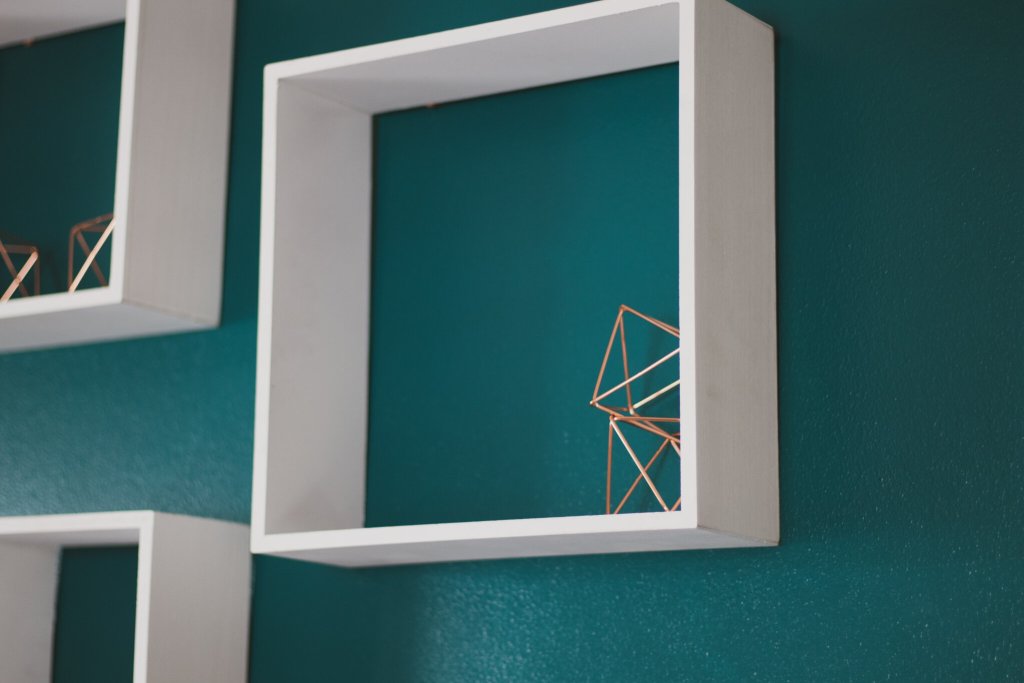
Ok, now into this guest room. I am so excited to show you all the reveal of this guest room. Before this redesign, the room was clunky and did not have much personality. While the bed spread was colorful, the furniture was a dark brown and the walls were a plain neutral. There wasn’t a design in the room, so it never felt like an intentional space. Instead, it felt cold and unwelcoming. The first thing I did to combat that was find inspiration in the rest of the house, which is well decorated and full of personality, and bring that into the room. I was led to a painting that had a lot of good colors to choose from. The color that stood out to me the most was teal and I immediately knew I wanted to paint the wall behind the bed one of the shades in the painting. I ended up going with Valspar’s “Gypsy Teal” which has a gorgeous tone and is richly saturated. It makes the entire room pop with personality as soon as you enter.
Once the wall was painted (not an easy task by the way!), it was important to me to focus on the bed itself. The furniture in the room, while dark, is very beautiful with fine details that make it pop. I mentioned before that the bedding was colorful, but it felt like a beach rental comforter (you know what i’m talking about!). I knew one of the items I’d be getting from AllModern was new bedding and oh did I?! I went with the Cogbill Duvet Set in blush pink that brings a freshness and neutral pop of color to the room. Yes, pink is a neutral, lol. The pink also brings a big pop of color, but also brightness in the space, while the style is very relaxed and feels homey and comfortable. To finish off the bed, I wanted to bring in elements that would give the room more color, without overwhelming the senses. I decided to go with big, solid color pieces, but made sure that they had texture to bring variety. One of these elements is an AllModern throw blanket that is a perfect match for the wall, but has a pulled knitted texture that draws your eyes to the detail. In addition to the throw blanket, the throw pillows I placed bring texture to their solid color profiles. I finished off the bed with a statement pillow that literally welcomes guests into the space!
Moving away from the bed, my focus was the wall opposite the bed. Since it was not painted as the wall behind the bed was, I wanted to bring some color and life to it as well. After all, it’s the wall guests are most likely to be staring at while in bed. On this wall, I also have a big window that is just off center. Originally, I wanted to put a pull down shade in the window to bring color and texture, but as we are keeping it budget friendly, I left the blinds that were there. Instead, I decided to move the over-the-door mirror I already had from the door to the wall. I sprayed it to match the metallic accents in the room and it fit perfectly in space that was smaller beside the window. On the other side of the window, I brought in the painting that first inspired the design. I turned it sideways to fit long on the wall and it was just the pop of color I needed, and just the right size that I didn’t need anything else there.
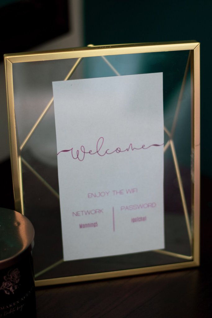
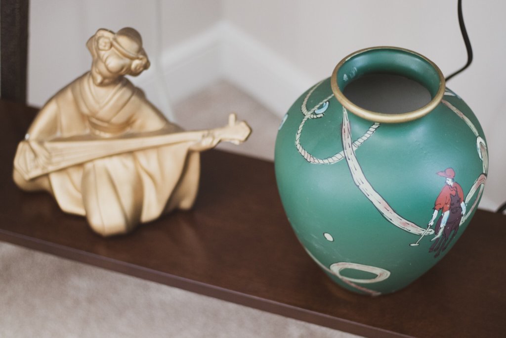
The final touches to the room came in the form of decor. They’re like the sprinkle of salt you put on a fresh baked chocolate chip cookie to elevate it and make the flavors pop. For decor pieces, I really wanted to bring in my mom’s decor style of a little global modern with pops of glam. I first started with replacing the lamp that was on the nightstand and removing the outdated radio. I got this really cool lamp from AllModern that is shadeless and has a big globe bulb and a copper neck. That brings just the touch of elegance to a really modern style lamp. It also takes up much less space, making it great for placing a glass of water or a phone when you’re in bed. It also looks amazing up against a painted wall and makes the wall color pop even more. Behind the bed, there are square shelves that hold a few trinkets that bring another layer of design to the painted wall. And the tv stand and nightstand bottom shelves hold books, candles and a vase that bring the global element into the room, in addition to the detailing on the legs of both pieces. The final element I picked up from AllModern is a beautiful brass picture frame that is a piece of art in itself. The design is a floating piece of glass in a well designed frame that brings geometric shapes into the design and plays off of one of the pillows on the bed. It holds a welcome sign with wifi information on the vanity and sits beside a teal tray that holds a little welcome arrangement of toiletries and a snack!
All in all, I used pieces I had in the house, combined with a small budget and totally redesigned the space! It went from a bland, lifeless room to an in-home escape for my parents or a comforting getaway for anyone that visits. Even if that someone is me! Watch the video below to see the full refresh!
Don’t forget to tag me in your photos online @lizeeangel or using #lizeeangel. And as always, comment below and please, like, share and follow me on youtube, instagram, twitter, facebook and pinterest!

